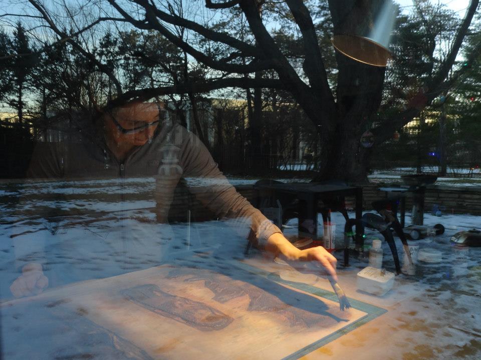
- Well, I am really trying to neutralize the hierarchy, I don't want one rock to be more prominent than the others, that is not the point. It's really about how they ALL COMBINE TOGETHER.

- 1- She creates elements that belong together
- Certainly it is a series, and it can all work well together, but I want each print to look like it is a SECTION of something, that's taken from. So there's more that might continue, but, of course I am not showing that it does, it's just that it's pulled out.
Laura Berman (LB) and Karl Marxhausen (KM) discuss the illusion of creating space and the translucency of hand mixed inks. She uses Graphic Chemical and Gamblin oil base inks. The monoprints are on a Rives heavy weight printmaking paper (250 gsm) and run through a press bed. Each of this series measures 19 inches square. Plastic wrap is put over the inks to keep them from drying out. She documents each color she mixes. Video runs five minutes.
KM: What are you working on?
LB: OK. I have these monoprints over here that I am finishing up. They are really close. And what I ended up doing was cutting down a bunch of old prints that I had started editioning, or they were already proofed and things I just hadn't finished. I trimmed them all on the same sides, a series of ten now going. So, there are lots and lots of layers. The idea is "to fill them edge to edge, crop them, as much as I can, almost like a pointillist painting." This is a series in progress, almost finished right now.
KM: And you said the edges are really important?
LB: Yes, they are. I'm trying to, certainly it is a series, and it can all work well together,
but I want each print to look like it is a SECTION of something, that's taken from. So there's more that might continue, but, of course, I am not showing that it does, it's just that it's pulled out.
KM: So, in a sense, you are creating a space...within the picture plane.
LB: Definitely, yeah.
Hand mixed inks

Monoprints are hung using clean
strips of print paper and clips.

Dried prints between gessoed boards and newsprint

The large round colored shapes in her monoprints are based on a specific collection of 125 small beach pebbles from Topsail Island, North Carolina, USA. Her rock shapes celebrate an event from her life, her marriage. For Berman, the rock shapes are unique and have personalities like that of people. The value she places on her collection brings her a sense of security and identity no matter where she lives. That said, she treats the enlarged forms in a different manner. As an artist she stays open to new possibilities.
2 - She pays attention to the moment
"These forms take on a LIFE OF THEIR OWN, the way you are thinking-- it is sort of like stepping stones. You have the rocks first, but when you are at this stage you are thinking: "OH WOW, WITHIN THIS SHAPE, WITHIN THIS SPACE, HEY, I LIKE THE WAY THIS (HERE) IS MOVING, I LIKE THE WAY THAT (THERE) IS MOVING. AND, I WONDER, IF I COULD DO SOMETHING DIFFERENT WITH THIS, AND TRY THIS (NEXT PRINT OVER)" So THAT is taking you further. As opposed to saying, "oh I have got to make it look exactly like this photo that I took. Or, exactly like whatever reference material I have. So it (the choosing) is more INTUITIVE, and like that." Karl Marxhausen
"Definitely. Definitely. I probably could never be an "editioning" printmaker. I must have A LOT OF PLAY when I am thinking. Otherwise I get really bored with the process. And it is not teaching me anything if I am just a "factory," and just executing one idea, the same idea over and over. I try to build in a LOT OF SURPRISE for myself as I print." Laura Berman

Tint extender
Four minutes. Laura Berman (LB) and Karl Marxhausen (KM) discuss what makes her colors translucent, her attention to the surface quality when using multiple layers, and the intuitive process of looking at your color choices, being open to new surprises, and letting ideas follow their own course.
3 - Her love of pattern -- from Barcelona.

Berman showed me the 63 photos on her studio wall. These remind her of the origin of the patterns that fuel her work. The colored ceramic and mosaic tiles used by the architect of her birthplace, Antoni Gaudi.
"I was born in Barcelona and my biological father was Spanish. I lived in Barcelona for my first year and my mother walked around the entire city with me daily. I suspect that the sights of Barcelona settled into my own aesthetic values from these very visual beginning points."
"I am a dual-citizen of Spain and the USA. My mother moved to Spain in the steps of her older sister, my aunt, who also married a Spanish man. They all lived in Barcelona before and around the time I was born. My aunt then lived in Madrid, and now lives in Alicante, Spain. My mother lives in North Carolina (her marriage to my father was short-lived– we left Spain when I was 1 year old and she remarried when I was 6 years old)." (courtesy of Berman email 5/29/13)
"My favourite architect is Antoni Gaudí. My most favorite building of his is Casa Batlló."
Three videos on Gaudi in Barcelona follow.
Three minutes. Gaudi structures in Barcelona.

courtesy of Thumbs Dream Time, http://thumbs.dreamstime.com/z/tile-background-park-guell-barcelona-spain-15377459.jpg, accessed June 13, 2013)
Eight minutes. Ten Things You Need To Know.


(courtesy of Dreams Time, http://thumbs.dreamstime.com/thumblarge_421/12481889905f3v3U.jpgaccessed June 17, 2013)
Eleven minutes. Barcelona, my city. In 2011
the population of Barcelona was 1,615,448 people.
the population of Barcelona was 1,615,448 people.
Berman's home town.
Laura Berman (LB) and Karl Marxhausen (KM) discuss the mosaics of Antoni Gaudi, her interest in pattern, memories of her mother walking her around the her birth city of Barcelona, her interest in things with history like the one hundred and three year old Kansas City Livestock Exchange Building, where she keeps a studio for her printmaking. Five minutes.
LB: (Of Gaudi) You know, breaking the definition of everything.  But another of his trade
 But another of his trade
marks is this mosaic. So he would apply mosaic to the surface to almost everything he did. All these chimneys at the top of this building are covered in little mosaic squares. (see side photo)
KM: Say where these photos came from again?
LB: These are from buildings in Barcelona. This is where I was born. When I was a baby my mom would stroll me around the city, just looking at these sites. And I actually had a great aunt that lived in this building (points to La Perdera) (see side photo)
LB: I think the patterns and colors of the textures of tiles and ceramics in Spain really influenced me on a fundamental level, cause I saw them a lot when I was a child.
KM: It is interesting that they are ceramic in nature as opposed to like patterns in nature...
KM: It is interesting that they are ceramic in nature as opposed to like patterns in nature...
LB: Yeah. But it's a very urban city. This is a building façade. It is a printmaking thing, they will carve into the tile and put a glaze color on top. So it is almost like a relief print on the ceramic tile, I forget the term, maybe, sgraffito?
KM: I was going to say sgraffito. That is what you usually do on bowls, pots, like that.
LB: But the whole buildings are covered with it. It's just beautiful. That one too up on the right.
Speaking on history out in the hallway:
"I love things that have history to them, old things. We live with a lot of vintage furniture. My son plays with vintage toys. I just love things that come with that kind of history. When I travel I like to research more about 'where I am' at than the art that has been collected there. Art does not affect me when I am traveling like a natural history museum does. I love those kinds of things that have that kind of story, it is sort of an excavation of history."
4 - Her dream has been to be accepted by her home locale.
"Círculo del Arte published 5 prints of mine last year (each in an edition of five). I printed these editions in my studio here in Kansas City and shipped them to the gallery once they were printed. The prints were on exhibit there this past spring, and also featured at Arts Libris in Barcelona last April. It is Barcelona's equivalent of the
Fine Papers and Prints Kansas City, and the EXPO KC." LB
Three minute video about Circulo Del Arte, above.
Six minute video about Arts Libris expo, next)
"I was invited to publish and exhibit a set of new prints with this gallery after meeting with them in the fall of 2011 during my sabbatical from teaching at the Kansas City Arts Institute. Circulo del Arte is a gallery and also a print publisher. They work with many artists to publish unique editions of their prints and they make these prints accessible to the gallery members. Members of the gallery receive a discounted price. I receive a set commission for every print the gallery sells." LB
"I rarely edition my work – it is possible– but I prefer to work in a more spontaneous manner. This project required that I create an edition, and we agreed on a small edition number of 5 for each print. My hope is that the prints will sell sooner than a larger edition would so that we can make another project together. So far, about half of the prints have sold!" (courtesy Berman email 5/31/13
"It has been a dream come true for me to exhibit in my birthplace and have collectors in Spain and in Europe for my work."
5 - Art consultants have been a plus for her
Laura Berman discusses finding a home for her monoprints, the advantages of having art consultants/ dealers, eleven monoprints sold to a hotel in Abu Dhabi, how the prints can stay together as a family, her rock prints at the KU med center take on a cellular look, and about being in relationship to arenas outside her studio, not working just for herself. Two minutes.
The hotel that purchased 11 of my monoprints last spring: Rosewood Hotel in Abu Dhabi, United Arab Emirates. ( http://www.rosewoodhotels.com/en/abudhabi/ )
The hotel that purchased 11 of my monoprints last spring: Rosewood Hotel in Abu Dhabi, United Arab Emirates. ( http://www.rosewoodhotels.com/en/abudhabi/ )
This interview took place Saturday morning, May 11th, 2013.


Laura Berman is an Associate Professor in the Printmaking Department @ the Kansas City Art Institute. Her studio is located in the Livestock Exchange Building, 1600 Genessee Street, Kansas City, MO 64102 (suite #350 on the third floor).
Her website is http://www.laurabermanprojects.com/.
Her blog is http://laurabermanprojects.com/lablog/
She was one of 20 vendors at the KC Expo in April 2013.
.
(Barcelona chimney tiles courtesy of Paris Parfait Typepad.com, http://parisparfait.typepad.com/.a/6a00d8341c8d9f53ef010535b35489970b-800wi, tile background Park Guell Barcelona Spain.
courtesy of Thumbs Dream Time, http://thumbs.dreamstime.com/z/tile-background-park-guell-barcelona-spain-15377459.jpg, http://thumbs.dreamstime.com/thumblarge_421/12481889905f3v3U.jpg, accessed June 17, 2013. Matfield Green exhibit link, courtesy of http://us7.campaign-archive2.com/?u=68c13d6cc1e401eb9066cc6ed&id=49693cb984&e=0e8069acc7, accessed July 4, 2013. Barcelona videos: Gaudi in Barcelona, http://www.youtube.com/watch?v=I3Lk5YwaVtE, Ten Things You Need To Know, http://www.youtube.com/watch?v=qMryMf2hOzU, Tour of Gaudi Buildings in Barcelona, http://www.youtube.com/watch?v=JsHVE9Lvr4Q, Barecelona, Mi Ciudad, http://www.youtube.com/watch?v=sGrKTiEOMUw,
accessed June 14, 2013. Kansas City Livestock Exchange building courtesy of http://livestockexchangebldg.com/home.php, accessed June 19, 2013. Circulo Del Arte link,
http://artslibris.cat/en/expositors/2013/circulo-del-arte/, http://www.circulodelarte.com/en/bcn-experience-0,http://www.circulodelarte.com/en/autor/berman/es, accessed July 1, 2013)