Wednesday, August 30, 2017

august - show n tell salon

Saturday August 12th Stephanie Leedy opened her building for the ever popular Show and Tell event. Nine collectors shared stories about TWO inked works from their personal collections.  Seventeen enjoyed the informal program by the Nelson Atkins Print Society. 


Double click to enlarge images.
 
"Artist Statement by Ben Beres. This etching has tiny words and sentences that do not make any sense. Even after ten minutes of study the content is unintelligible. I think that is the point Beres is trying to make about artist statements. I love this piece."  Paul Sokoloff

More on Ben Beres here


Curtis Smith shared a two color lithograph by the Italian print maker Alda Fana 


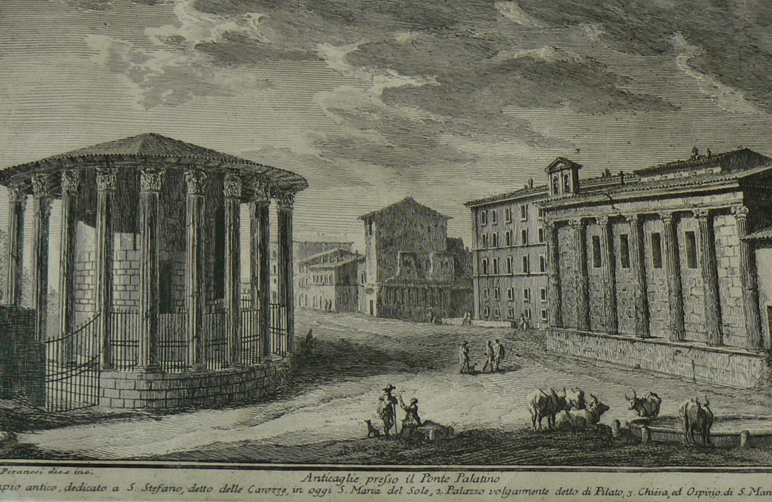
"Giuseppe Vasi modified the dress of people on his etched plates for the purpose of tourism." David Mc Gee    
 
 For more about Vasi the etcher.


Susan Lawrence and Charlie Paynter presented collaboration work by Ben Shahn and Leonard Baskin. Entitled "Beatitudes."  It was a print from her parents.


Etcher Andre Zorn is known for his particular style using parallel lines. Steve Pruitt


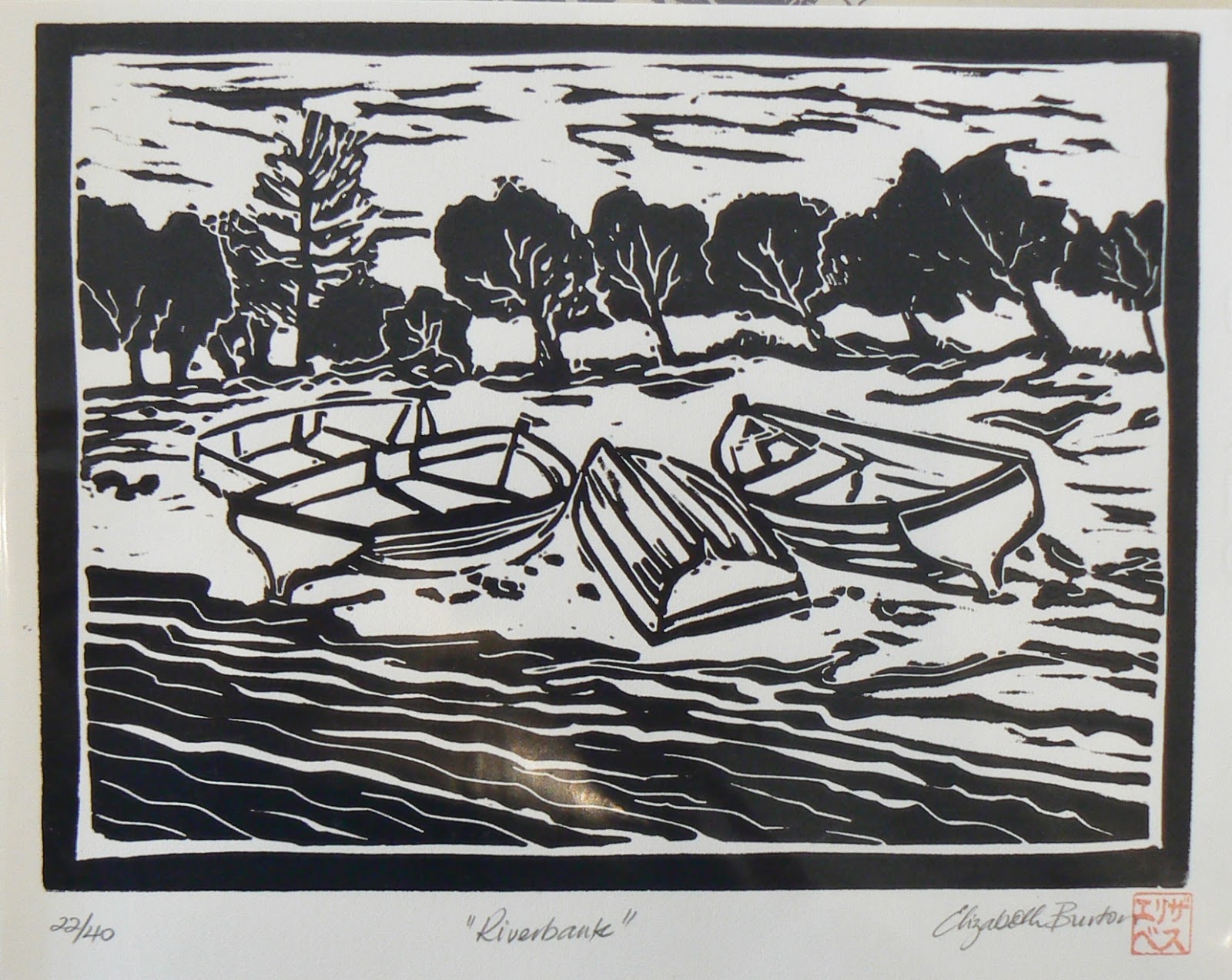
When I participated in the 2011 Exchange #3 black and white prints through Lets Trade Prints, I received twenty-two other inked works from Australia, France, Russia, Canada, Pennsylvania, Minnesota, Illinois, Wisconsin, Washington, Maryland, and California. In the post was the lino cut, River Bank by Elizabeth Burton from Queensland, Australia. Karl Marxhausen


John Mallery showed us a high-end archival box for prints, above.

"Maritime etchings of Arthur Briscoe came from his first-hand experiences on the sea." John Mallery


 "In the lithograph Nemesis by Austin Osman Spare, the artist depicts signals from the unconscious mind. At the bottom of the print you can see the nose of the dreamer, above which is a portrait of the artist. Some called Spare the father of surrealism." Paul Sokoloff


Passing around an illumined magnifying glass, members studied the fine details of boxwood engravings by Thomas Berwick. The Newcastle map and photos also were passed around.

 
"Many of his hard wood engravings appeared in children's books. Berwick learned the trade in from the Newcastle engraver Ralph Bailey. Berwick walked the three mile route everyday and you can walk the same route today when you are in Newcastle. I have." Paula Winchester


"My son David was in fifth grade when he did this lino cut impressions for the haunted house challenge. He must have spent twenty minutes cutting on this lino cut block every evening. He got help from our neighbor Russell Ferguson." Curtis Smith


A lithography by Elizabeth Layton


Seven minutes. Part 1
Don Lambert related his encounters with Elizabeth Layton

"Elizabeth did a drawing called Censored. Where she has been censored. Her principles have been crossed out. Inspired by the drawing, she did this lithograph. This was produced by The Lawrence Lithography Workshop, that is Mike Sims in Kansas City. It was done in edition of one hundred and they all sold." Don Lambert


Two minutes. Part 2. Layton's print "Remembering Names," next.


"They are all our children now, she said. In other words, when you are a mother and you lost a child, you understand what every mother goes through in a tragic time like this." Don Lambert


After I saw the woodblocks Herschel Logan carved out at the Beach Museum of Art in Manhattan, Kansas - I learned by trying it myself. Designs drawn first, next cuts on a linoleum block. The largest learning curve for me was inking twenty-three impressions that looked alike.[check LINK] What a headache!! The result was my lino cut called Moss Creek #1. I tried to do a sky like J.J. Lankes might do. Karl Marxhausen


Steve Pruit shared lithograph by Childe Haasam (1859-1935), after the series of Flag paintings.


show and tell event, 
August 12, 2017


Wednesday, August 16, 2017

miguel rivera - kcai printmaker

 "I was looking at this sense of expression. It fulfills me."    Miguel Rivera


This artist printed to INVENT SURFACES. 

Particles. The interface of materials on top of the next. What is below peeks through layers above. An inked impression from a routed woodcut with a specific design meshed with atmospheric elements. Karl Marxhausen

Rivera told me to look at Dr. Atl and David Alfaro Siqueros. I did. Each of these experimented with materials in order to invent the surface.


Look at the Mexican painter and writer Gerardo Murillo Cornado (1875-1964), who was known as Dr. Atl. He was the first to work with pigments. In the book of his 1914 Paris exhibit: Exposition Atl: les montagnes du Mexique, Atl introduced fellow artists to what he perfected in 1906, a solid material one could paint with. He named it Atlcolor. He had figured how to lay pigments on pigments. And how to keep them from falling apart. In his book The Landscape, an essay (El Paisaje, un ensayo), 1933, Atl described his solid resin-based pigments under the heading of  "Las inovaciones (The Innovations).     It was Atl's experimentation with wax, pigment, resin and gasoline that Rivera wanted me to find. 
[https://www.vialibri.net/years/items/348980/1933-atl-dr-pseudonym-of-gerardo-murillo-el-paisaje-un-ensayo-landscape-an and http://www.artnet.com/artists/dr-atl-gerardo-murillo/biography and http://inverarteartgallery.com/artist/dr-atl/ and  http://chnm.gmu.edu/transatlanticencounters/items/show/4639 (accessed July, 18, 2017]


Here is an entry I found about Atl's stencil prints: take note of the use of resin varnish - the experimentation - inventing of the surface.

"The two remaining stencil prints, here called Red Volcano and Erupting Volcano, are untitled, lack stenciled friezes, and have other characteristics that suggest they were both made as experimental proofs around 1921-23 (Erupting Volcano is printed on the same type of laid paper as the Philadelphia album cover) and may in fact be rare examples of the type of enameled Atl-color prints-- estampes émaillées (procédé special)-- he exhibited in Paris in 1914. In both prints the artist animated the surfaces of the stenciled images with a fine mist of spattered Atl-color pigments, which he most likely blew onto them through the twin pipes of the metal fixative applicator commonly used to stabilize powdery pastel and charcoal drawings. In both cases he also made use of the resin varnishes that he described under the heading "Las inovaciones" (Innovations) in his 1933 book El Paisaje - un ensayo." (18. Dr. Atl, El paisaje--un ensayo, p. 13.) 

"In Red Volcano he stenciled his colors on top of a ground of transparent varnish that covers the entire sheet of paper. In the more complex Erupting Volcano, the artist built up the composition in layers, first painting onto a sheet of gray paper a ground of zinc white mixed with casein the same size as his intended image, followed by stenciled colors, then spattered colors, and ending with a coat of transparent varnish over the entire image except for the cone of the volcano rising above the clouds, which he embellished with Atl-color crayon that extends the composition of the spewing volcano into the margin of the sheet. Like many graphic artists in the West during the late nineteenth and early twentieth centuries, Atl incorporated in his designs many features typical of the traditional Japanese color woodblock print --stark outlines, flat expanses of color, and the playful visual conceit of allowing an element of a composition to intrude into the otherwise empty enframing margin--and made them distinctively his own.      John Ittmann, Mexico and Modern Printmaking: A Revolution in the Graphic Arts, 1920 to 1950 (2006). 

Look up David Alfaro Siqueros. He used pumice powder with resins, mixing, to build surfaces. He used it for murals as long as a wall. He was working like a construction worker.      Miguel Rivera

 Beginning in 1935, Siqueiros began using Duco, a nitrocellulose automobile lacquer developed by General Motors and DuPont in the 1920s. These tools and pigments countered what Siqueiros termed Mexico's "folk art for export," by which he referred to artists' proclivity to produce an art for tourists.(pg.77).. At the start of the 1930s, Siqueiros produced a series of crusty easel paintings made while under house arrest in Taxco, Mexico. In these works, he began experimenting with materials, as in the painting Proletarian Mother (1930) in which he combined local clays with resin, applying both to a fibrous jute surface (pg.81) …  the role of "accidents" --the spill, the stain was central to the experimental procedures of Siqueiros's workshop. While one handling of the spraygun could assure a quick-drying and slick surface unmatchable by oil paint applied by paintbrush, a more experimental approach to Duco led to unforeseen results.

As Siqueiros wrote in one letter to his friend and occasional benefactress Maria Asfinsulo
in 1936:
“I make use of a painting accident, through which two or more colours are sprayed on and as they become absorbed into each other produce the most fantastic and magical forms that can be imagined; it can only be compared to geological formations, to the multi-coloured and vari-shaped seams seen in mountains, to the cell-construction which can only be seen under a microscope. [...] a kind of tumultuous, stormy dynamism, a sort of physical and social revolution, which is quite frightening.” (pg.96)   
 ["IMPORT/EXPORT: RAW MATERIALS, HEMISPHERIC EXPERTISE AND THE MAKING OF LATIN AMERICA ART by Niko Vicario M.A. Curatorial Studies Bard College, 2008http://dspace.mit.edu/bitstream/handle/1721.1/101545/940564400-MIT.pdf?sequence=1, accessed July 1, 2016]


This fascination for creating surfaces sounded more like what one did when painting. I shared with Rivera the delight I felt when I used crushed oyster shells, elmer's glue, and acrylic paint. The way the pigments separated and created spontaneous patterns which I enjoy. See next detail. More at  SEE 1 and  SEE 2.


As we sat chatting in Cafe Nerman Thursday afternoon, Rivera told me of the time he once baked a painting in an oven. It was while he was an exchange student at South Oregon University in Ashland. He had painted layers of gesso on masonite. He couldn't wait for it to dry, so he went next door into the ceramics room and set the masonite in a raku kiln that was still warm after a firing. He went on to say that he pressed objects into the wet gesso with his hands. When the masonite was completely dry he used oil paint on the hard surface, and then wiped it off in places with his hand. Just like an etcher wipes excess ink off the copper plate with the palm of his hand. Miguel Rivera said: "I was a pr-ainter. The cross between a printmaker and a painter." He had a smile in his eyes.


His most recent explorations on BFK paper employ drawing and layers like a painting but with the unfolding process of a print maker. One can dissect the components. There is a woodblock design. There is printers ink. There are tiny black particles. There is a manner of making. Miguel Rivera's way. But Rivera downplays the use of technology. Preferring the outcome. All methods were a means to an end. This is what he told me:
I had this concept of virus spreading through culture for a print. I designed the geometric of the virus. The woodblock plates were made with routers. But I did not want just the geometic. That would be boring by itself. I wanted to create “shadows of embossment.” As a resist for the next stage, I draw with toner powder. Using a magnet under the paper to move the toner around. I use a transparent base. This (work) is not process based. It is not a technical thing. It helps create this hidden metaphor.    Miguel Rivera


Three minutes. The first plate of his print was on cedar plywood. It had a vinyl stencil of a "retina" cut with a router. The second plate used in his print had the  of a bacteria virus scanned from Washington State University, a school  he attended. The second plate was tinted with toner powder instead of ink. That is, the toner particles sat in the grooves of the second plate and was run through the press. Together, the subtle layers of inked color, paper embossing, and particles of toner dust, created the qualities  that Rivera was after.


Two minutes. More interactions on paper that Rivera is fond of. Detail, above.


His wide triptych monoprint was pinned on the classroom wall with student help at the Kansas City Artist Institute. With many drawings and efforts leading up to this image, Rivera regards this image as mature.
I would call it a mono print. Because I'm using the matrix. The virus, in this case, conserves the matrix. I am using the matrix to do things it wasn't meant to do.   Rivera
Well, but you are, that's one way of framing it. You can say these are traditional materials, and I'm not using them the way you should. But on the other hand, you are using it for the purposes you as an artist come up with.   Marxhausen
It is like another drawing device. When you think of painting, it would be another layer of paint.  Rivera


Five minutes. Mono print.


Miguel Rivera was interviewed by Karl Marxhausen, Thursday March 3, 2016.
2 pm to 3:26 pm in Café Nerman  and on campus of the Kansas City Art Institute.


[Oyster shell surface treatment, courtesy of Karl Marxhausen,

http://www.karl.marxhausen.net/core.l.html and http://karl-marxhausen.blogspot.com/2008/11/karl-marxhausen-being-led-elsewhere.html accessed July 1, 2016]


Monday, August 14, 2017

one pass - Blanche Lazzell


Two minutes. Suzann Geringer knows what a single pass through the press can achieve. As a print maker she has built up many images with multiple passes on her own press. She has done collograph, etchings, dry point on plastic, and chine colle.

For that reason she was very impressed at the SINGLE PASS impression Blanche Lazzell had achieved. In this clip, Geringer shows her surprise and Katelyn Crawford explains how the many parts of the Provincetown block were inked in many colors first and then run through the press in a single pass. One can observe that the grain of the many inked wood block portions go the same direction.  

The Lazzell color woodcut was part of "The 1930s In Prints" exhibition at the Nelson Atkins Museum of Art, in April of 2017.


Sunday, August 13, 2017

master printer - aaron shipps

In the afternoon Aaron Shipps, the master printer at Bedrock Art Editions, had Print Society members up to see his collaboration with the artist Andrzej Zielinski.


 Two minutes. Arrival to upstairs work studio.

Our day had started seeing the collaboration of Jasper Johns with master printers. That is, an artist unfamiliar with printmaking methods, sharing his ideas with one who is familiar, the master printer, and then the two of them figuring out how to best achieve the artist's idea in a given medium - like an etching, a lithograph, a monotype, a screenprint, a woodcut, and the like.

In this case, it was Aaron Shipps who was the master printer who worked with artists like Andrzej Zielinski and others in Kansas City.


Eight minutes. Master printer. Shipps showed us an earlier proof that served as a template for a unique project. From this both the printer and the artist decided on the final colors and subsequent foldings. More on that process http://www.bedrockarteditionscom/zielinski-ouroboros-shredder/ (courtesy of Bedrock Art Editions, http://www.bedrockarteditions.com/about-bedrock-art-editions/, accessed July 15, 2017)


Metal sculpture of shredder was one way artist Andrezej Zielinski worked out his ideas. He worked in many mediums, painting, drawing, monotypes, and now lithographs.

Andrzej Zielinski gave a talk leading up to his most recent edition. A remarkable dilemma, solved by printing specific areas on both sides of the paper, having a template of precision cuts, and then carefully folding the whole sheet to form the final work. Amazing.


Twenty-four minutes. Shipps and Zielinski. 

Reception took place July 15, 2017.