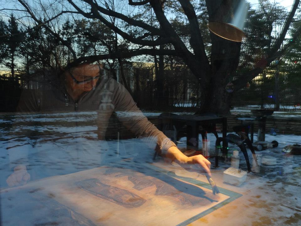
It was Greg Schieszer who helped me make sense of this gallery-thing at Shawnee Mission West High School, in Overland Park. It was late Wednesday morning, when the security officer handed me my visitor badge and gave me directions to the art gallery on the campus. I hoped to see my friend Catherine Vesce, hear her presentation in the gallery, and watch her lead a viscosity demo in the art classroom.

According to Schieszer, the gallery and the artists that were invited to present their work were a strategic part of the AP program. The Advancement Placement program enabled high students to receive top level scholarships to good art colleges.
Composition assignment for sketchbooks to be used for printmaking. One minute. Schieszer brought this point up in the gallery talk with print maker Catherine Vesce.
Before we leave, please comment on these pieces, and see how they can tie that into sketchbook approach to collecting images, creating images. Greg Schieszer
The way I made these was, I have a way of picking and choosing little bits, I have a stack of papers that have been printed on myself. I printed all these things and sometimes they don't work so I cut them and lay them aside. So, that's what this is, putting together bits and pieces of things that didn't go so well. (see next images) Catherine Vesce


This one here (above). I find different things to print just to see what will happen, you know. So I don't know if you can tell what this might be from? (yellow circles) I just inked a rubber band and set it down on the paper. There are so many things that are around you in daily life. Hmm, I wonder what that (impression) would look like if I inked that? You better check with your mom before you do that, but it could be really interesting. Catherine Vesce.


Karl Marxhausen (KM): You were telling me the students turned in portfolios. Say some more about that, please.

KM: What positive outcomes have you seen from this program? GS:
Well, first one benefit is that it exposes my students to the work of professional artists. It sets a level of expectation for the quality of
work  they do. A lot of them will take part in a Senior Show. Because of
how artists have installed their shows (on our campus), students will
strive for that level of profession-alism.
they do. A lot of them will take part in a Senior Show. Because of
how artists have installed their shows (on our campus), students will
strive for that level of profession-alism.
 they do. A lot of them will take part in a Senior Show. Because of
how artists have installed their shows (on our campus), students will
strive for that level of profession-alism.
they do. A lot of them will take part in a Senior Show. Because of
how artists have installed their shows (on our campus), students will
strive for that level of profession-alism.
KM: That is something you can definitely measure and quantify.GS:
Yes. I have seen it with my eyes.
 Another AP outcome is that a lot of
students get top level scholarships. Some of my former students at this
high school are currently studying at the Chicago Art Institute, as well
as the Savanna School of Arts and Design in Georgia. There are students
attending the Kansas City Art Institute. KM: When did this program begin at your school? GS: The WESTPatron Gallery opened on our campus in 2008. KM: So, that was when you first started doing this? GS: I had been teaching art prior to that. After the gallery opened I took over the role of gallery director.
Another AP outcome is that a lot of
students get top level scholarships. Some of my former students at this
high school are currently studying at the Chicago Art Institute, as well
as the Savanna School of Arts and Design in Georgia. There are students
attending the Kansas City Art Institute. KM: When did this program begin at your school? GS: The WESTPatron Gallery opened on our campus in 2008. KM: So, that was when you first started doing this? GS: I had been teaching art prior to that. After the gallery opened I took over the role of gallery director.


KM: What do you want your  students to gain from listening to outside artists? GS: One thing I try to have the artist talk about is: What
motivates you as an artist? Why is it important to be an artist? In the
case of Catherine Vesce, she had taught art at the high school level
for many years and then retired, but she kept on doing her own art. How
did she begin? What was her background? Students are interested in career connections in relationship to art.
students to gain from listening to outside artists? GS: One thing I try to have the artist talk about is: What
motivates you as an artist? Why is it important to be an artist? In the
case of Catherine Vesce, she had taught art at the high school level
for many years and then retired, but she kept on doing her own art. How
did she begin? What was her background? Students are interested in career connections in relationship to art.
 students to gain from listening to outside artists? GS: One thing I try to have the artist talk about is: What
motivates you as an artist? Why is it important to be an artist? In the
case of Catherine Vesce, she had taught art at the high school level
for many years and then retired, but she kept on doing her own art. How
did she begin? What was her background? Students are interested in career connections in relationship to art.
students to gain from listening to outside artists? GS: One thing I try to have the artist talk about is: What
motivates you as an artist? Why is it important to be an artist? In the
case of Catherine Vesce, she had taught art at the high school level
for many years and then retired, but she kept on doing her own art. How
did she begin? What was her background? Students are interested in career connections in relationship to art.
.
Three minutes. Vesce on drawing her sister at age twelve and being told to notice things by her uncles and aunts. To develop to the eye of the artist.
When I was a kid down at the cabin in the summer the elders, the aunts and uncles, were telling me TO NOTICE THINGS. To notice the color of the sky, to notice the birds singing, the way a plant was growing, an education in seeing the world around you. The way artist's see those things is in shape and line and color and value, the elements of art. A lot of people DON'T SEE THAT. Some of you really notice things and others may not much. I think everyone starts by drawing stuff. Catherine Vesce


 artist always have a demo following their talk in the gallery? GS: It depends on what the artists do and whether I think my students will benefit from it. It's my call.
Eleven minutes. Students in the AP program were intrigued with the demo in Schieszer's classroom. Catherine Vesce (CV): I think I need to make a peanut butter sandwich, ok, stay with me here. If you imagine you are at home and you are going to make a peanut butter sandwich. You got your peanut butter and your jelly. Which one are you going to spread on the bread FIRST?
Students (S): Peanut butter.
CV: Why? That's right. Because the jelly, if you put it on first, you would have a real hard time spreading the peanut butter on. So, that is the whole principle here about viscosity.
S: But wait. Don't you put one on one piece of bread. (class laughs)
CV: Is that how you do your peanut butter and jelly sandwich?
S: Are you not supposed to do that? (more class laughter)
CV: I tell you teenagers are the most clever and amusing.

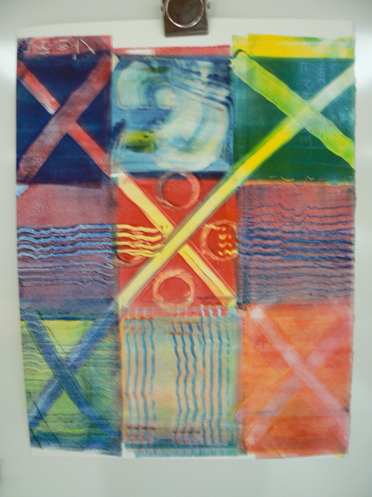
 This viscosity monotype had multiple colors rolled on top of each other on the plexiglass plate with a brayer. Akua Ink was used. Portions of the plate were wiped off. A variegated tool was dragged across the surface to create wavy lines. Amazing. The finished monotype measured 12 by 15 inches and was printed on Rives BFK paper.
Students (S): Peanut butter.
CV: Why? That's right. Because the jelly, if you put it on first, you would have a real hard time spreading the peanut butter on. So, that is the whole principle here about viscosity.
S: But wait. Don't you put one on one piece of bread. (class laughs)
CV: Is that how you do your peanut butter and jelly sandwich?
S: Are you not supposed to do that? (more class laughter)
CV: I tell you teenagers are the most clever and amusing.



.
Five minutes. The inked plexiglas plate was moved to the press bed and only one proof was pulled.
http://spotlightkcprint.blogspot.com/2013/05/catherine-vesce-kc-printmaker.html
More on AP program, click on http://media.collegeboard.com/digitalServices/pdf/ap/ap-studio-art-course-description.pdf, accessed Sept.14, 2015
Greg Schieszer is an art  and
photography instructor at Shawnee Mission West and an active member of
the Nelson Adkins Print Society.
and
photography instructor at Shawnee Mission West and an active member of
the Nelson Adkins Print Society.
 and
photography instructor at Shawnee Mission West and an active member of
the Nelson Adkins Print Society.
and
photography instructor at Shawnee Mission West and an active member of
the Nelson Adkins Print Society. 
Photos and video taken Wednesday, Sept. 9, 2015 at Shawnee Mission West High School, 8800 West 85th Street, Overland Park, Kansas
Phone interview Monday, Sept. 14, 2015 5:09 to 5:30 pm